Reproduction numbers, R, are epidemiological metrics used to estimate how many people a patient is likely to infect and, therefore, how fast an epidemic will spread or recede. R is not a biological constant for a pathogen, a rate over time, or a measure of disease severity.
In this web site, R is the Constant Daily Rate of Growth calculated over a period of 14 days. Download the paper “Guide to COVID-19 Indicators” for more information.
How is the US and Texas Doing?
The followings are the last five weeks of US Constant Daily Rate of Growth, (R), for Confirmed, Deaths, Recovered, and Active:
Limit =1 Limit = 1 Limit =1 Limit = 0
Jun 4: R(Confirmed) =1.0005 R(Deaths) = 1.0009 R(Recovered) = 1.0011 R(Active) = 0.9599
Jun 18: R(Confirmed) =1.0003 R(Deaths) = 1.0006 R(Recovered) = 1.0005 R(Active) = 0.9770
Jun 25: R(Confirmed) =1.0004 R(Deaths) = 1.0005 R(Recovered) = 1.0005 R(Active) = 0.9845
Jul 2: R(Confirmed) =1.0004 R(Deaths) = 1.0004 R(Recovered) = 1.0004 R(Active) = 0.9937
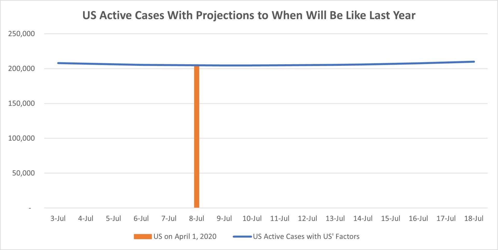
Week by week, the Constant Daily Rate of Growth of Confirmed, new cases, calculated over 14 days is above 1, but decreasing, which means that the epidemic is been controlled. In the last 28 days, R (Active) is now below 1, meaning that the number of Active cases is decreasing. On July 2, in the US, there were 21,069 daily new cases; previous week was 14,914. In Texas there were 1,878 daily new cases; previous week was 1,729. The highest daily new cases in the US was on January 6, 2021, 305,390 cases/day
Chart 1A

Doubling Time
May 28, 2021 - The number of Confirmed cases in the US will double to 34,444,920 in 900 days, November 14, 2023
Jun 18, 2021 - The number of Confirmed cases in the US will double to 34,176,494 in 1,266 days, December 4, 2024
Jun 28, 2021 - The number of Confirmed cases in the USA will double to 34,113,207 in 2,332 days, November 16, 2027
Jul 2, 2021 - The number of Confirmed cases in the USA will double to 34,595,550 in 824 days, October 3, 2023
Chart 1B
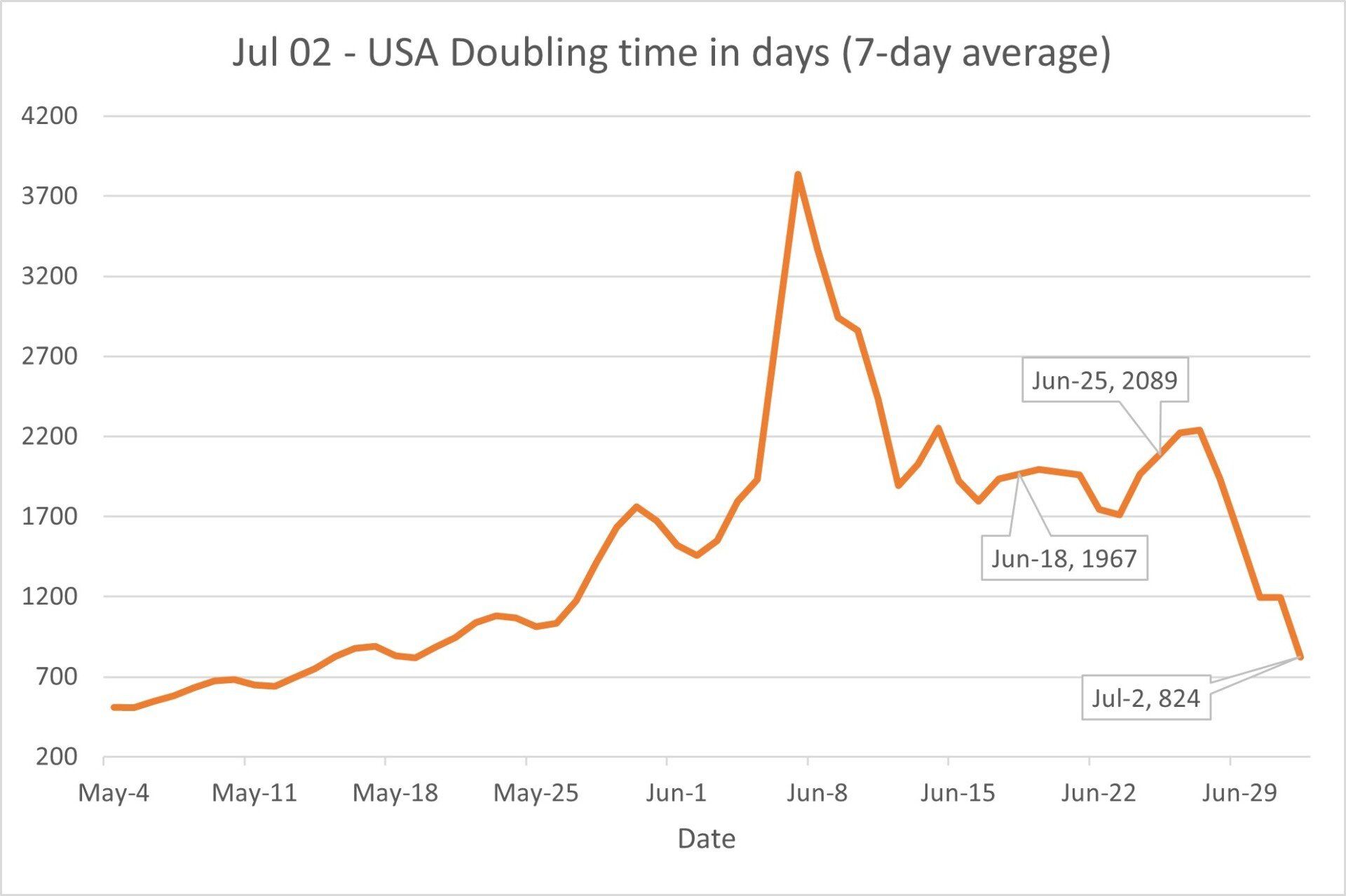
The number of days that it will take for a country to double the number of Confirmed cases is also an excellent indicator to determine if COVID-19 is receding or not. It is a good sign when the number of days to double increases; the epidemic is receding. If the number decreases, the epidemic is not receding.
Forecasting
For the forecasting calculations, the Constant Daily Rate of Growth, R, is multiplied by a factor m to reduce the differences between current and forecast values, kind of a smoothing spline. The new linear daily rate of growth r is equal to r = m * R. The m factors are calculated separately for Confirmed, Deaths, and Recovered values and therefore are different.
If a country is controlling the epidemic, at some moment in time, the number of recovered and confirmed cases should be the same, no more new confirmed cases, and everyone recovered.
Chart 2 shows the forecast values of Confirmed, Deaths, Recovered, and Active. To forecast those values for the US and Texas, I use the Final Total Infected formulas developed by Dr. Fookfah Yap, an Associate Professor of Engineering at Nanyang Technological University, Singapore. The Google Sheet he uses to estimate the COVID-19 reproduction number, doubling time, and final infection number for different countries can be viewed here. https://docs.google.com/spreadsheets/d/1rRwucxmdn5YqHVkelbEWaIuUdWauXyym39B8xr2aEHQ/edit?usp=sharing
The following is the link to his website, https://cv19.one/
Recovered is increasing faster than new confirmed cases, the gap is decreasing. It is an indication that US Forecast Recovered and Forecast Confirmed cases would be the same soon. These are good news.
See more information on how m is calculated at https://www.mmogollon.com/coronavirus-references
The forecasting coefficients of determination, R², are shown in the charts below.
The forecast calculations use data from the University of Virginia, "COVID-19 Surveillance Dashboard," that uses a special algorithm to calculate Recovered values based on Confirmed values.
https://nssac.bii.virginia.edu/covid-19/dashboard/
Chart 2
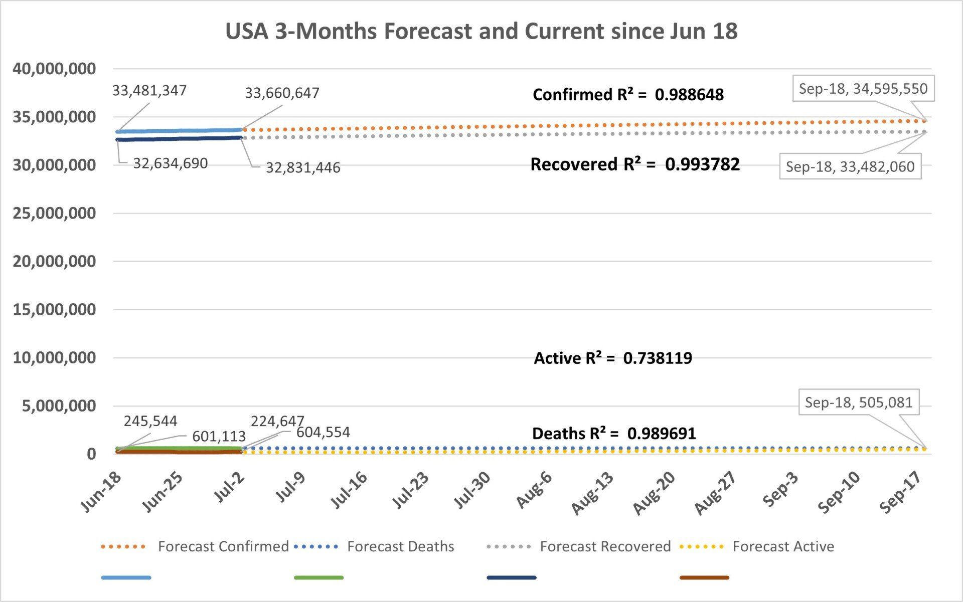
Chart 3
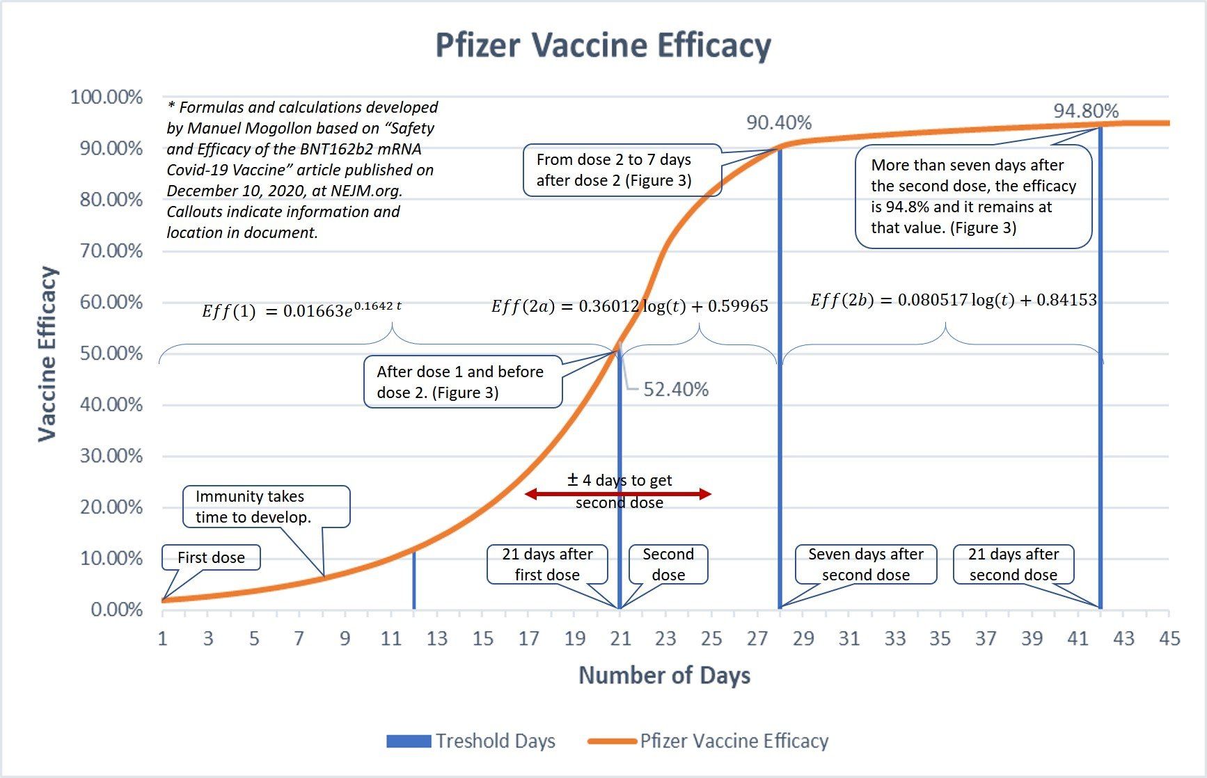
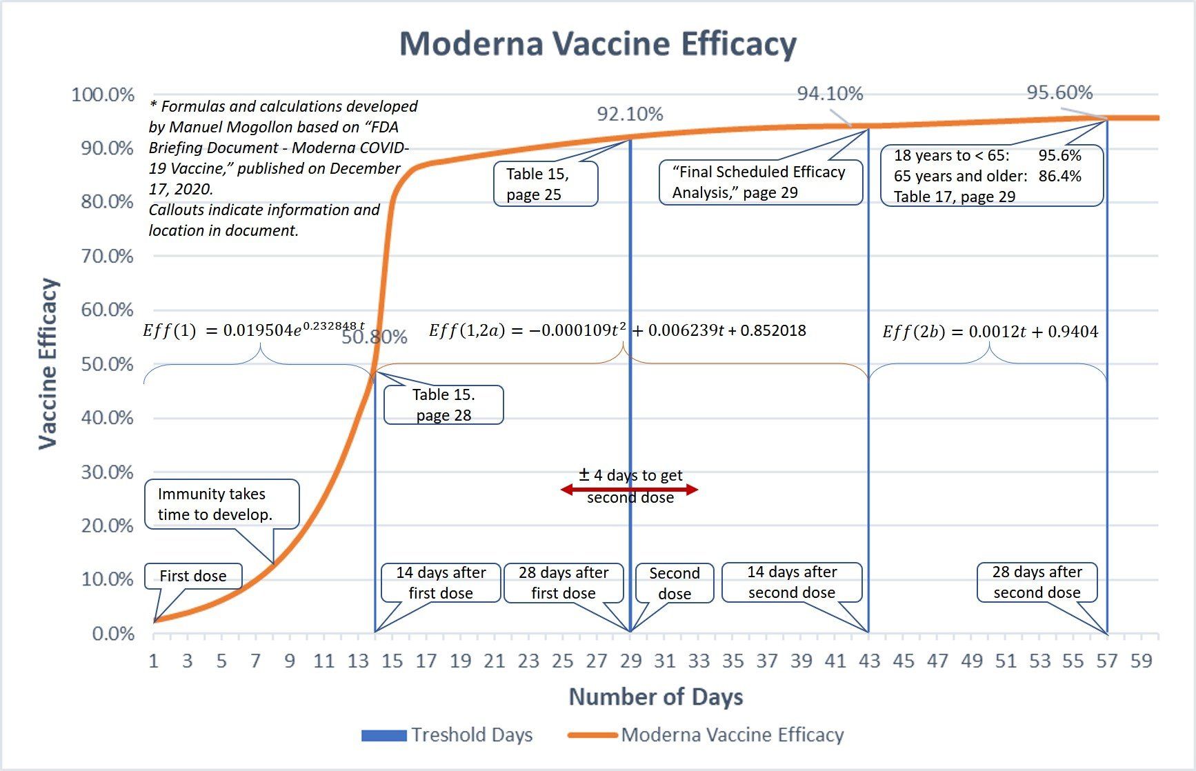
Vaccine Efficacy
Determine your immunity level by looking at the corresponding number of days after vaccination.
Based on a Pfizer article published on December 10, 2020, at NEJM.org, the first dose vaccination efficacy is 52.4% after 21 days. Seven days after the second dose, the efficacy is 90.4%. Twenty-one days after the second dose, the efficacy is 94.8% and remains at that value from then on.
Based on a Moderna article published on December 17, 2020, by the FDA, fourteen days after the first dose, the vaccine efficacy is 50.8%. Fourteen days after the first dose and before the second dose, the efficacy is 92.1%. Fourteen days after the second dose, the efficacy is 94.1% and twenty-eight days after second dose is 95.6% and it remains at that value from then on.
Sinovac’s 51% efficacy only just exceeds the WHO’s 50% efficacy threshold for Covid-19 vaccines. More than 350 doctors and medical professionals have contracted Covid-19 in Indonesia despite the majority of healthcare workers having been immunized with Sinovac,
Note: CDC website and Texas Websites show the number of people that have been vaccinated and the number of people who have received the second vaccine.
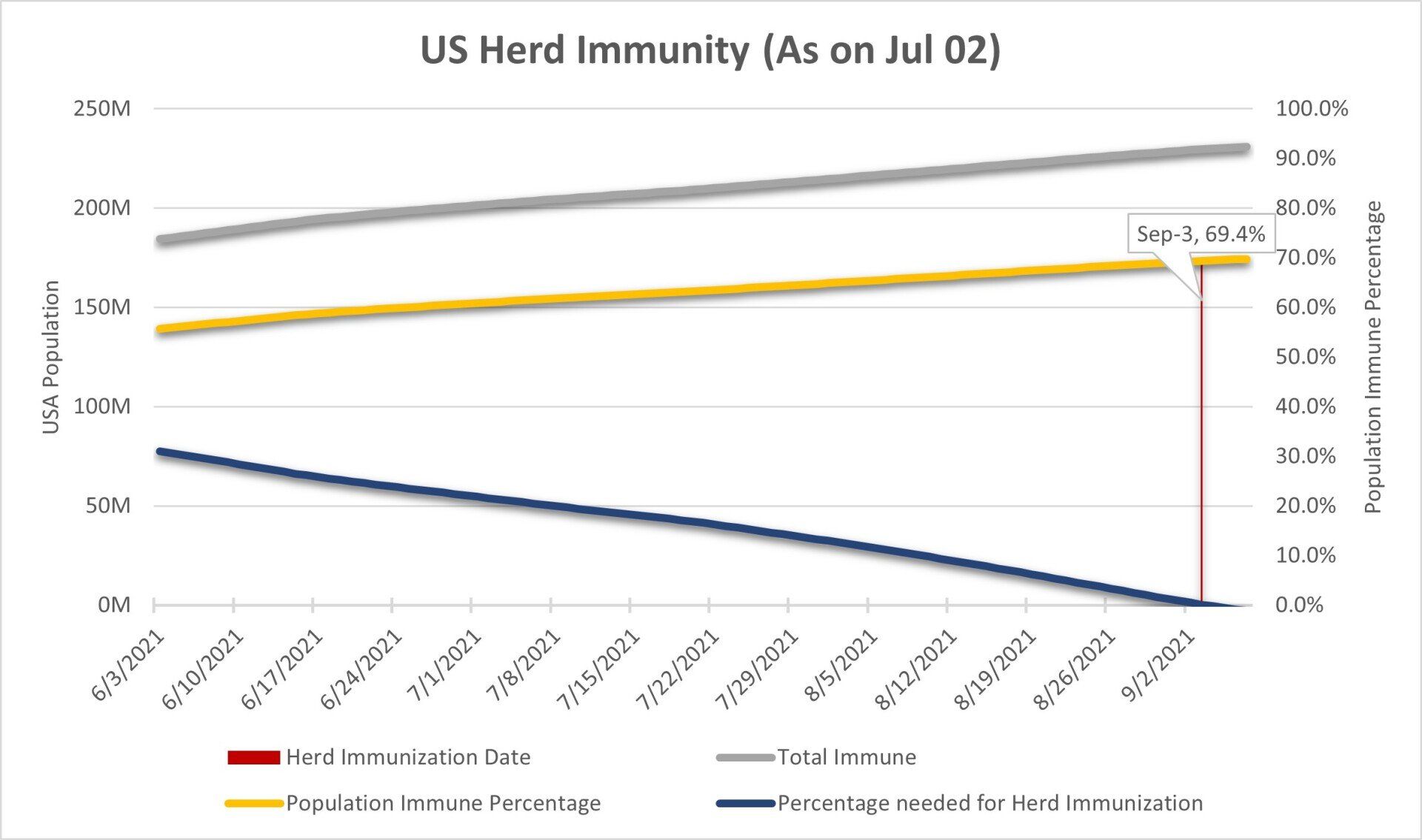
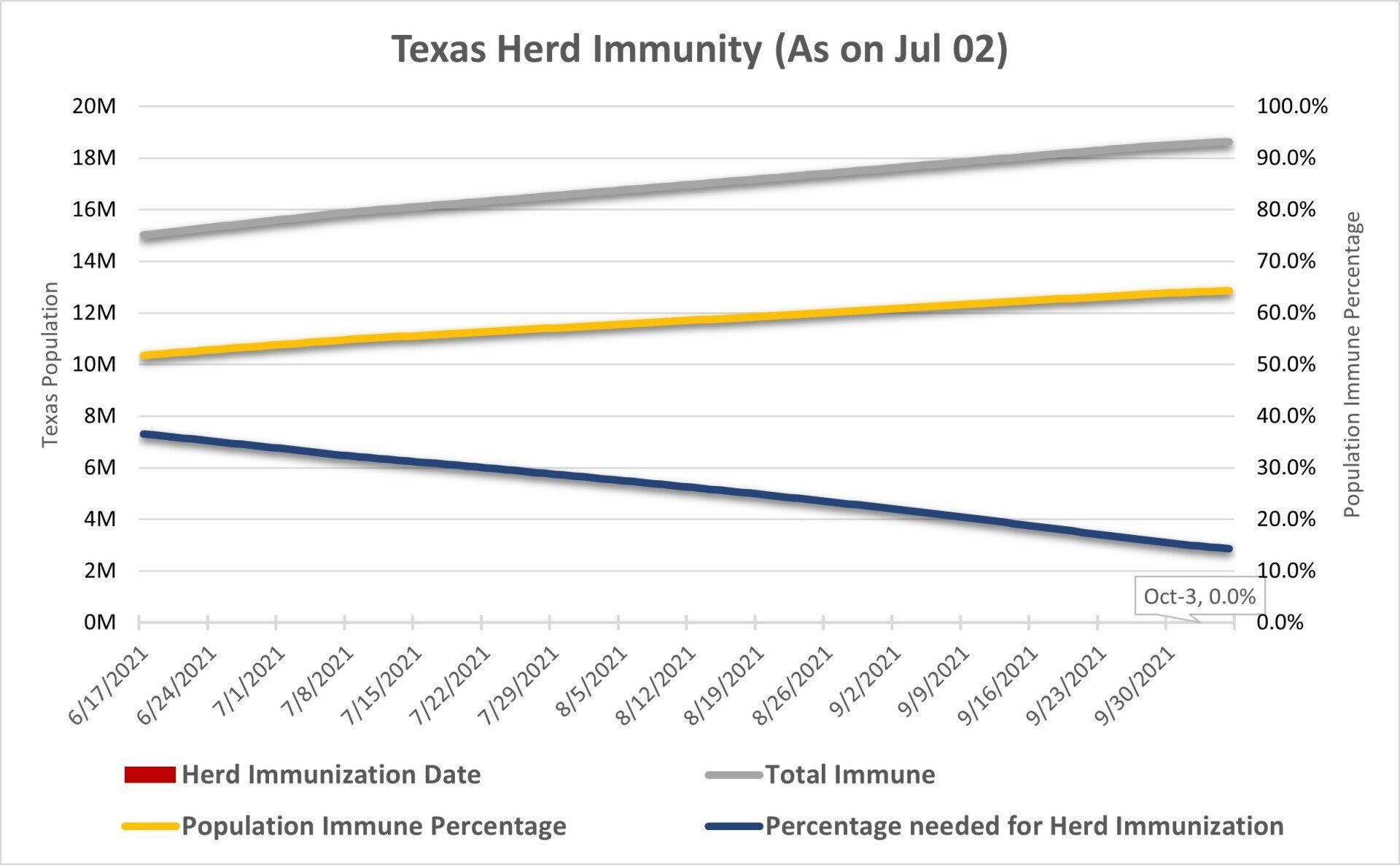
US and Texas Herd Immunity
Chart 3 shows US and Texas Herd Immunity forecast using a Ro = 3.27. The blue line is the percentage of the population needed for herd immunization over time. The grey line is the number of immune people (Recovered + Vaccinated * Vaccine Efficacy), as more and more people get vaccinated, and as the number of recovered people increases. The yellow line is the immune population percentage over time. As time passes, the percentage of the immune population increases, and the requirement and time t for herd immunity decreases. A country achieves herd immunization when Re(t) ≤ 1, not in the graph, when the percentage needed for herd immunization is zero or when the yellow line value equals the blue line's initial value. For the US, that date is September 3, 2021; in Texas, the vaccinated population is 44% and growing very slowly. There is not a forecast date for Texas herd immunity for the next three months.
Assumptions:
- The number of Recovered people will continue growing at the same daily rate of the last 14 days, 0.052% for the US
- The number of vaccinations will continue increasing at the same daily rate as in the last fourteen days, 0.267% for the US
- The number of first time vaccinations per day in the U.S. will top at 600,000. As of July 2, 2021, it was at 463,621 per day.
See more information on how Herd Immunity is calculated at https://www.mmogollon.com/coronavirus-references
The number of daily new cases has been reducing week by week since April 15.
As you can see in the chart below, the recent decline since April 15 is much gentler than the declines during most of January and February. The reasons aren’t clear, but it’s another sign that the pandemic is ending in the near future. The average decrease between the weeks of May 28 and June 18, was 3%. In the last couple of weeks, the number of daily cases has been increasing.
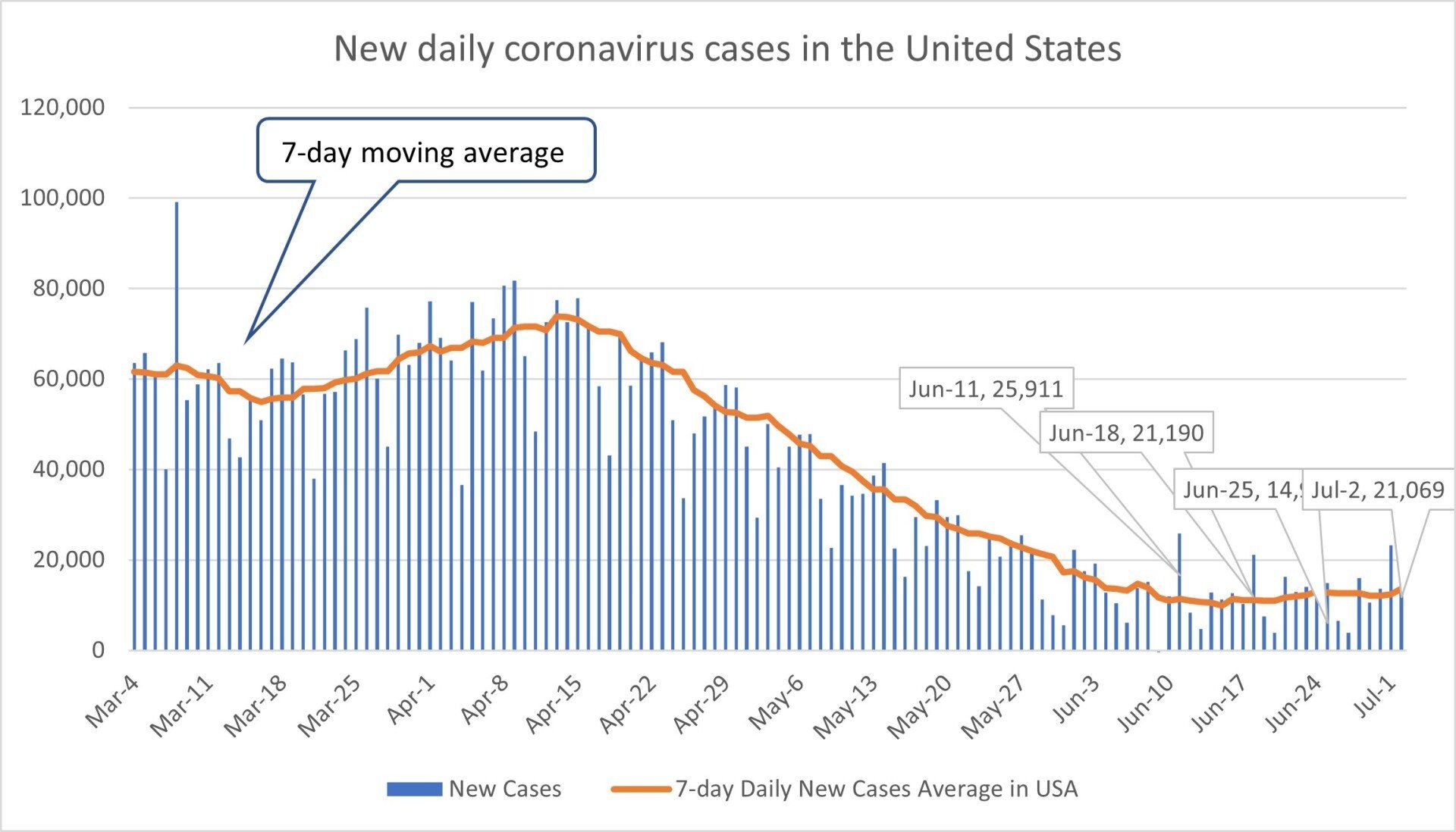
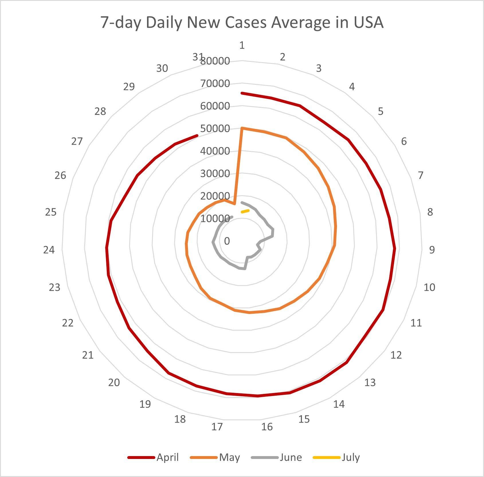
Chart 4C - Nightingale Diagram of New Daily Coronavirus in the US per Day and Month
The Nightingale Diagram allows seeing, in an easy way, what is happening month by month. For example, during March and April, COVID 19 was ramping in the US, and during several days in January 2021, the number of new cases per day was 300,000. April and May were much better than January.
- The R (Active), the green line, crossed the value of 1 and remained below 1.
- The K1-Factor, the red line, is increasing to its limit of 1.
- The K2-Factor, the blue line, is decreasing to its limit of 0.
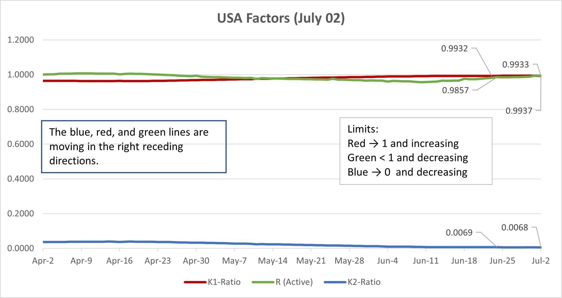
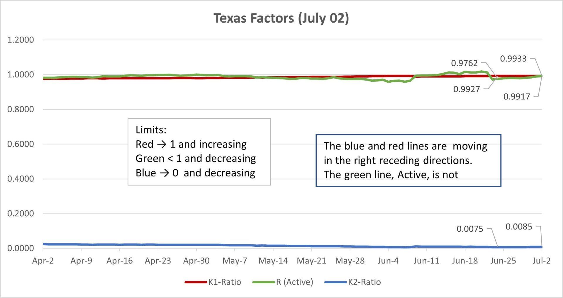
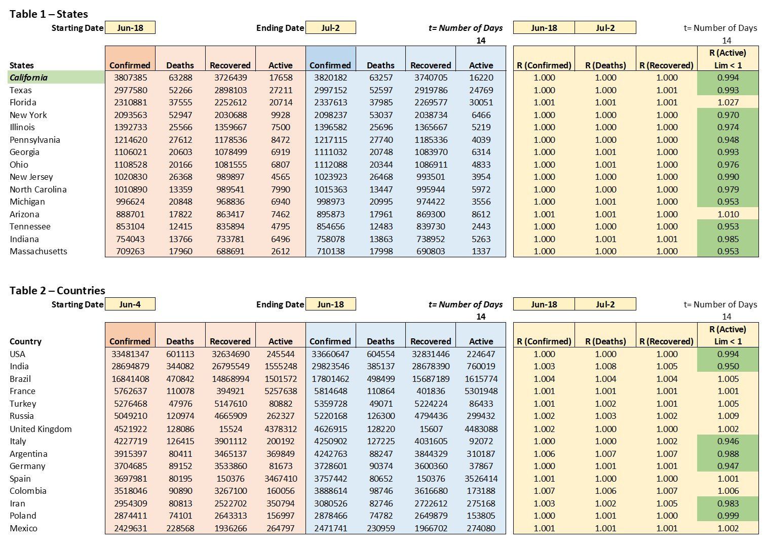
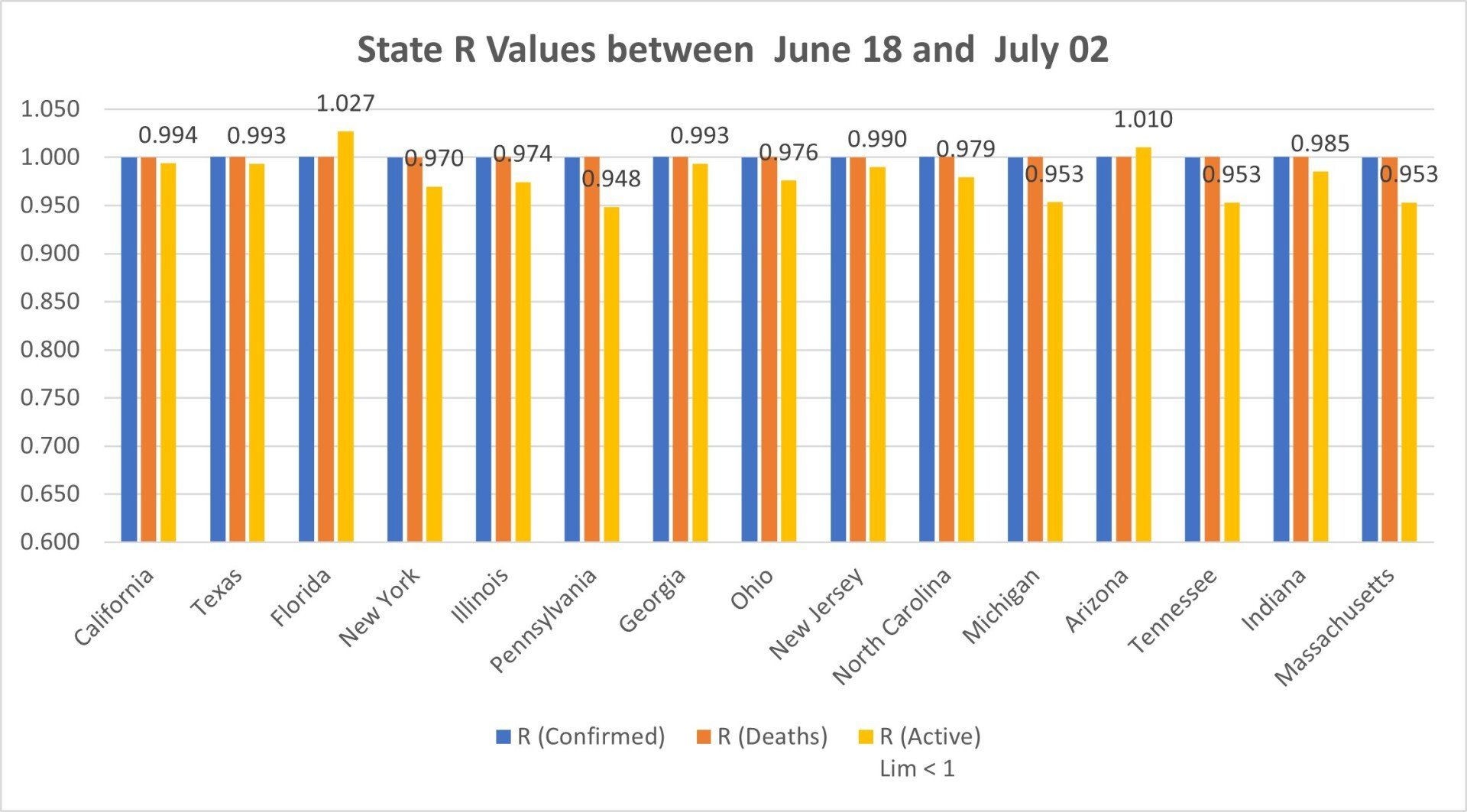
Chart 6 State R Values by New Cases
Chart 6 shows the top fifteen states with the highest rate of increase in new cases. The blue bar values indicate the rate of increase in new cases in the last 14 days.

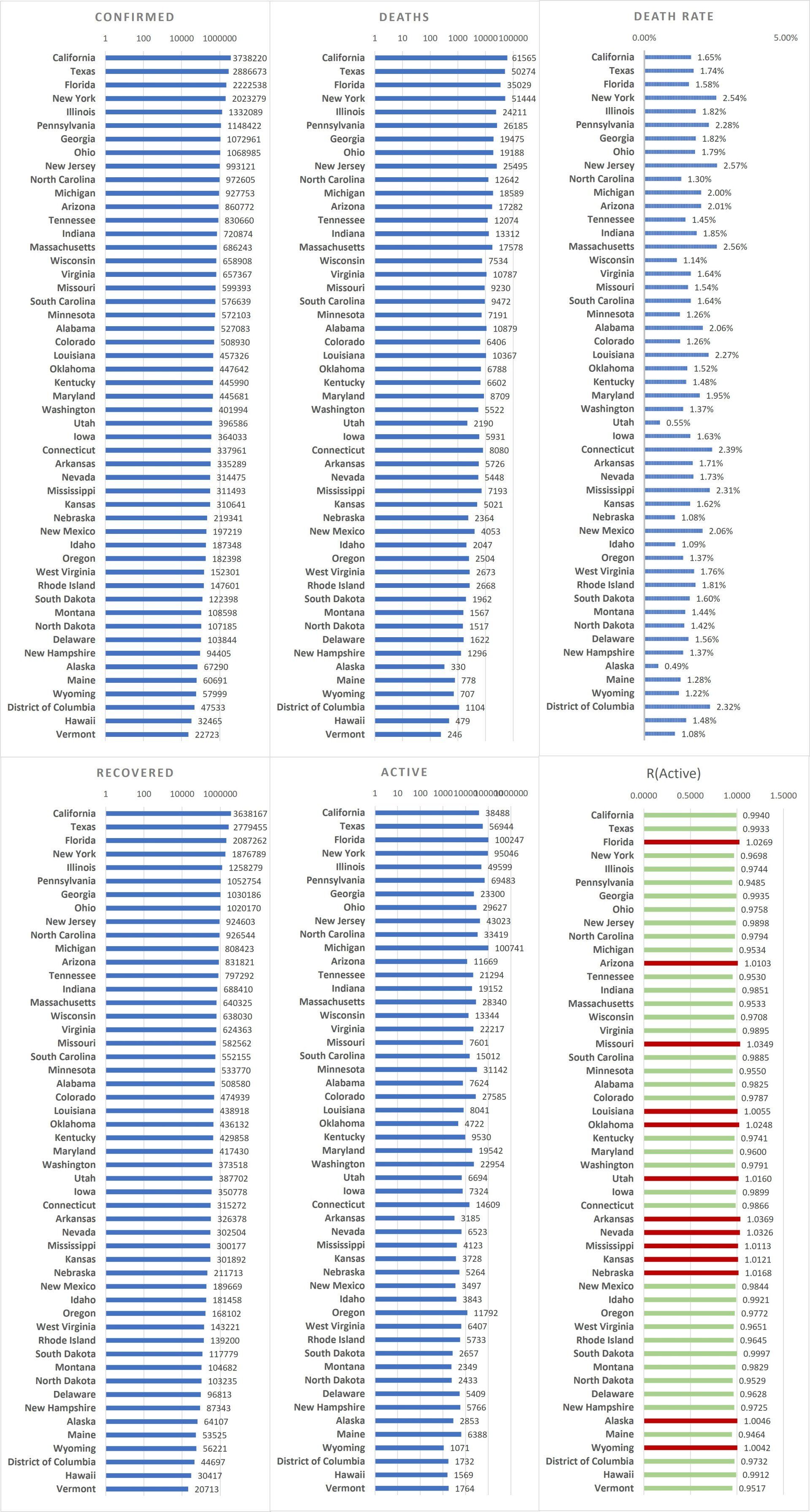
US State data is from to the University of Virginia COVID-19 Surveillance Dashboard
https://nssac.bii.virginia.edu/covid-19/dashboard
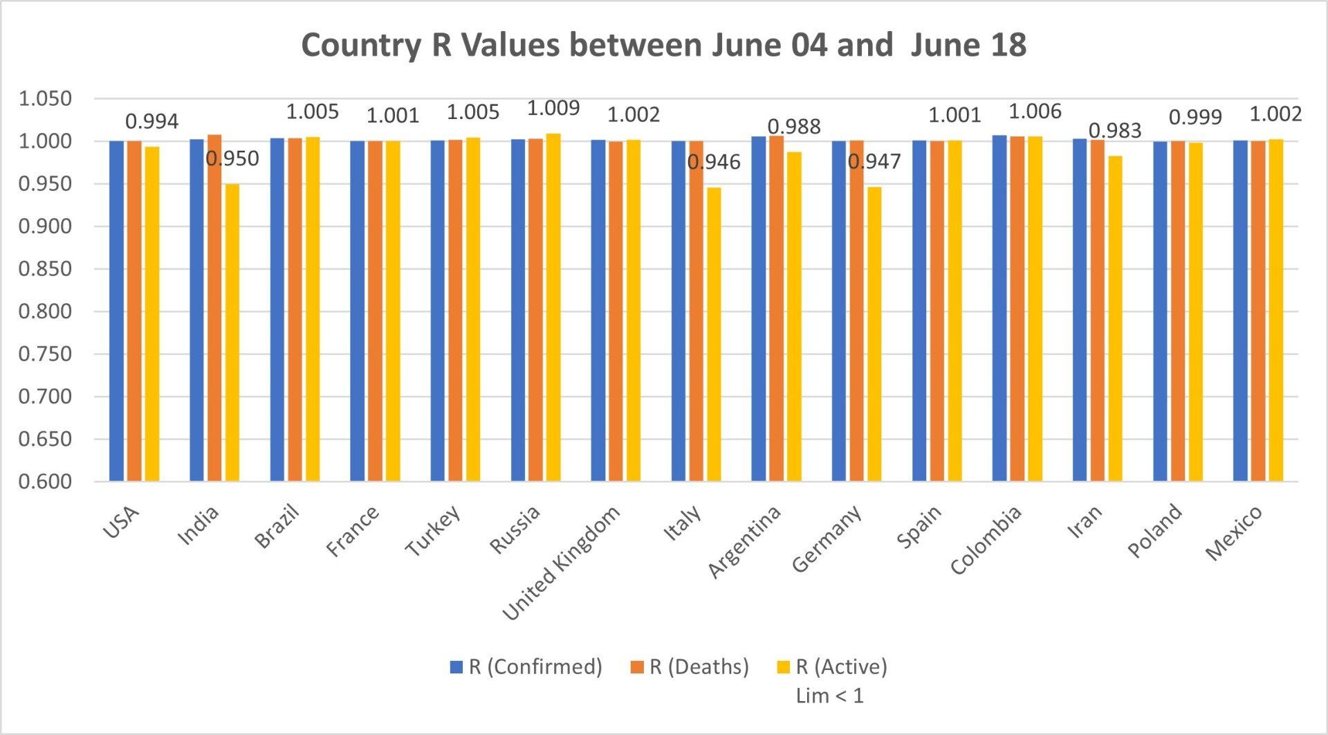
- There are now 188 countries with confirmed cases.
- Only the top 25 countries are shown in the chart below.
- Country data is from COVID-19 Dashboard by the Center for Systems Science and Engineering (CSSE) at Johns Hopkins University (JHU). https://github.com/CSSEGISandData/COVID-19/tree/master/csse_covid_19_data/csse_covid_19_time_series